There’s been a lot of buzz this year about logos – from the subtle but successful update of the Walmart logo to the complete overhaul of the Cracker Barrel brand that got the Uno reverse treatment. People are paying more attention to logos and visual identities than ever before.
When we think about a brand at FSM, we see it as the voice of the company. How do we want people to feel when they encounter our brand? Do we want to sound warm and welcoming or authoritative and commanding? Either tone – and everything in between – can be conveyed through a carefully crafted arrangement of shapes, colors, and typography.
This led us to ask an important question: Is our own logo speaking in our voice?
After some reflection, we realized it wasn’t. But instead of seeing that as a problem, we saw it as an opportunity to realign our brand with who we’ve become.
How Do You Know It’s Time for a New Logo or a Rebrand?
It’s a question we’ve heard from many clients over the years – and one we recently asked ourselves. Here are a few common signs it might be time for a refresh:
- The logo’s structure no longer fits the organization.
- It feels dated or generic – maybe even a little embarrassing to hand it out on a business card.
- The rest of your brand (typography, colors, overall style) has evolved, but your logo hasn’t.
- The logo you started with reflects a different voice than the one your brand has grown into; it just doesn’t fit anymore.
For us, it was the last one. Over time, we built a visual identity that looked and felt like us – which resonated with our team and our clients – but our logo didn’t quite fit anymore. It was time to realign our logo with the brand we’d evolved into.
So, how did we bring the core elements from our brand together into that careful arrangement of shapes, colors, and typography? We wove a few of our favorite details into the new logo design.
The Anatomy of Our New and Improved Logo
The Afterglow
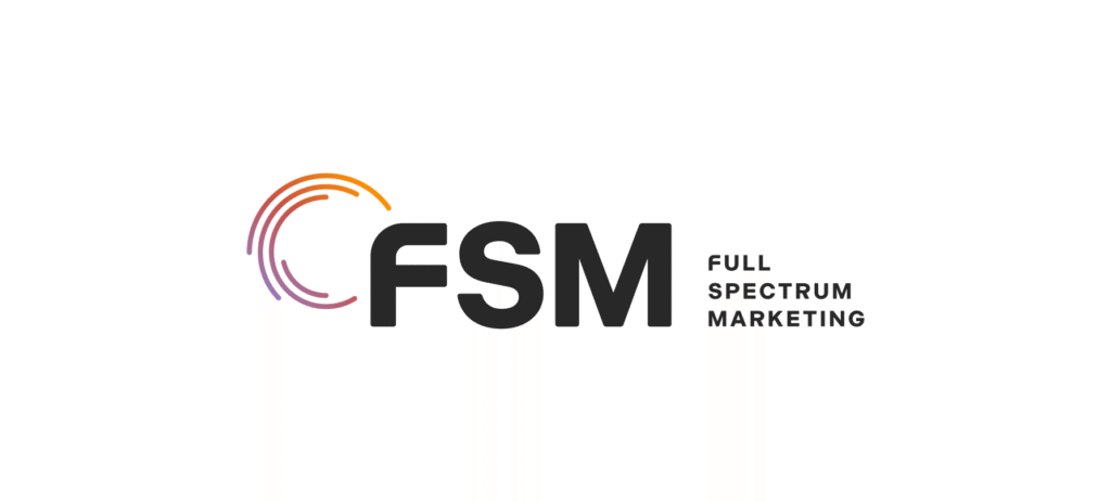
One of our most meaningful brand evolutions is the Afterglow Spectrum – a visual representation of our why. We knew we wanted that concept to shine through in our logo glow-up (see what we did there?).
Concentric Semicircles
Paying homage to our original logo, we kept the concentric half- and quarter-circles, but broke them out of their box and refined them with a clean, subtly rounded edge.
Overlap of the Spiral and the F
To connect the “FSM” typography in our logo with our concentric semicircle brand mark, we aligned the left edge of the “F” into the gap of the half-circles, joining the two forms into one cohesive unit.
Rounded F
Another nod to our original logo, the rounded shape of the “F” recalls our past while aligning with the softer, rounded edges we’ve introduced across our brand materials in recent years.
Logo Variations
As much as we’d love to be recognized by acronym alone, we’re not quite there yet – so we created a version of our logo that spells out “Full Spectrum Marketing.” We wanted to ensure our name is out there for the world to see!
Updated Colors
Finally, while working with our former colors, we realized the palette felt a bit too muted. We decided to turn up the volume just a few notches to really make our colors really pop.
Is Your Brand Ready for Its Own Glow-up?
At FSM, one of our favorite core values is Bold & Honest – and we hope that being bold and honest about our logo refresh needs has helped inspire you, too! If you’re considering a brand refresh for your own organization, contact us today!


