How Colors Controls The Perception of Your Business
How Colors Controls The Perception of Your Business

To date, this column has focused a great deal on the function of marketing, rather than the form.
For example, discussions of where people seek information, how search marketing is changing, the ways that Facebook adds a useful dimension to your marketing, and more.
The technology of marketing – from printing on paper to algorithms – has always controlled the delivery of the message.
We have not yet introduced much to chew on in the way of form – the creative thinking and presentation that is designed to activate an audience.
So, let’s discuss how you present your business creatively.
Think of your ads, your direct mail, your Facebook posts, or your website – your creative marketing assets.
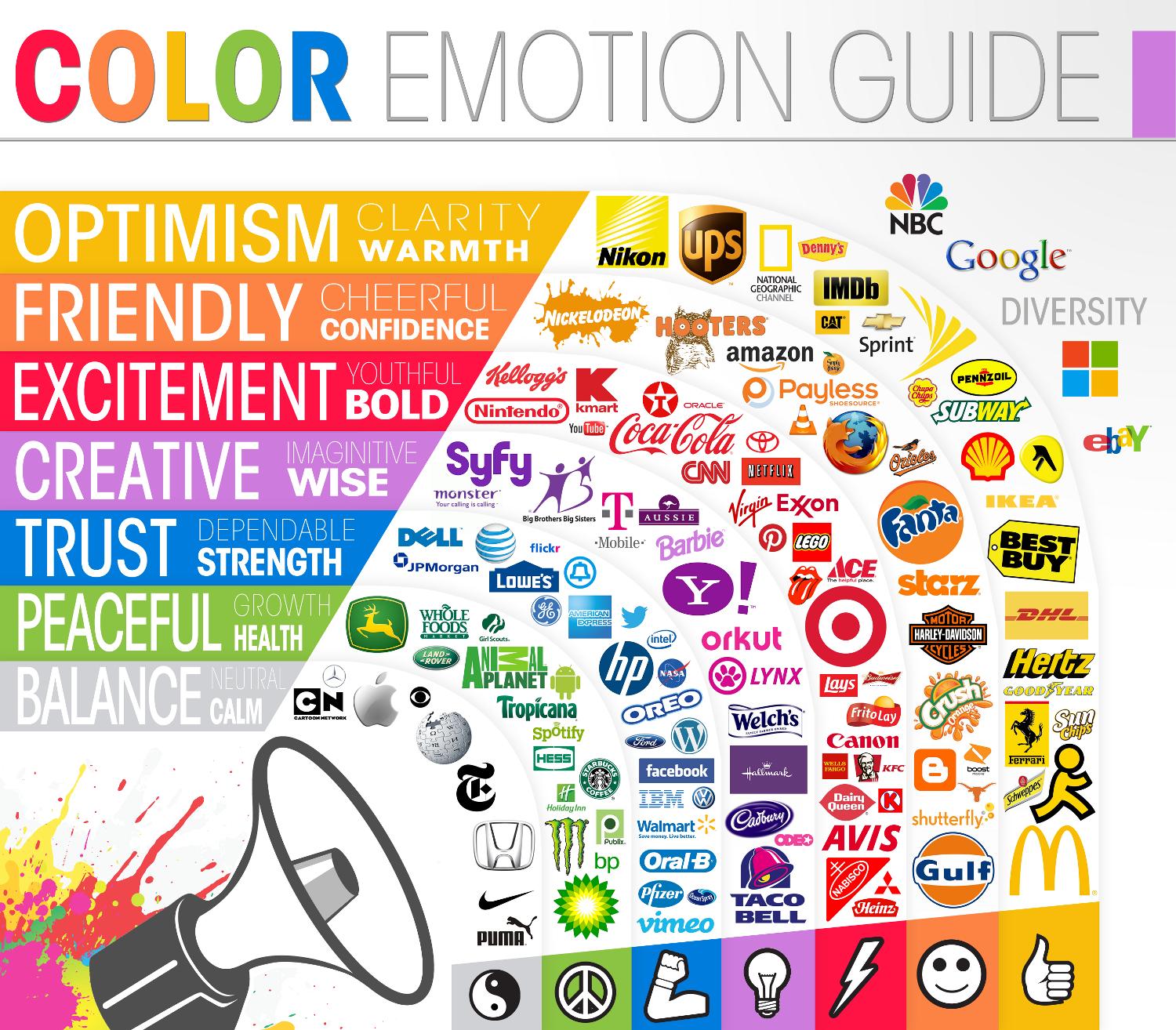
Research shows that different colors conjure different feelings for the target audience you’re hoping to attract.
What color dominates your marketing and your business? Is it sending the right message?
To help figure out the answer to that question, let’s take an old-fashioned matching quiz…
Match the color to the desired emotion (don’t cheat and scroll up to look at the picture!):
Emotion Color
Optimism Gray
Balance Orange
Friendly Blue
Peaceful Yellow
Excitement Green
Trust Red
Creativity Purple
How do you think you did? Was it harder or easier than you thought?
(If you’ll pardon a shameless plug, learn the correct answers this week by checking out Full Spectrum Marketing on Facebook.
It will probably not surprise you to learn that there have been a LOT of studies on color in marketing. It’s another case where something visual is rich in scientific theory and data to drive smart decisions.
For example, The Interactive Effects of Colors study shows that when the right color is used for the right product or brand, it makes a positive difference in the willingness of a potential customer to engage with a brand. It’s a theory called “perceived appropriateness,” which is a decision an individual makes in a split second without thinking too deeply.
The lesson here is that it’s useful to think hard about what color you want to use to define your business, then choose your marketing designs. Color, then design.
Take a logo project, for instance. Let’s pretend you have an insurance business and you are about to redo your logo.
How do you want your business to be perceived? I don’t know about you, but given the options above, I want my insurance business to be trusted more than anything.
The color that provides the most appropriate perception for trust is a cool blue.
In the off chance you don’t believe me about blue, consider Progressive Insurance, Nationwide Insurance, and Geico (and I could list more!).
If Progressive’s logo was red, would that change the way you feel about their business? It would for me.
One of the most important decisions you’ll when it comes to marketing assets is the first one – the color. It’s the decision that creates a framework for the rest of the creative elements to fall into place.
Which color delivers the right message for your business?


0 Comments